- Call Us: 9962113012
- Email us: lifestyle.interiors20@gmail.com
- Working Hours: 08:00-19:00
Car showroom Interior Design and Contractors
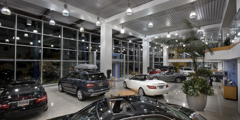
Although a car showroom technically falls in the category of retail design, its unique product showcasing makes it a genre of its own. Typically, car showrooms have two parts: the actual showroom and the workshop that’s located in the back. Occasionally, big brands go for a personal track which can be used for a test drive as well.
We at Lifestyle Interiors, focus on quality driven standards with our design and contract works.
This type of showroom interior design is basically for marketing. You’re creating a siren call for the customers to attract them to your product, which means there needs to be visual connection to the exterior. This is why car showrooms like Toyota, Suzuki and Honda have large glass facades from where you can see the featured cars.
Car showrooms also need to be spacious because you’ll have to drive the featured cars inside, and the display needs to be large in scale so each car has a specific square footage to itself where potential customers can easily and thoroughly observe it
As far as the ambiance goes you need to focus on the branding – maybe incorporate the company logo into the floor pattern or the backdrop. Sleek, sophisticated and futuristic are the themes that you need to work in, if you truly want to make a grand impression on the customers.
Our experts find the optimal solution for car dealers: creative ideas are combined with the brand standards. There may be requirements for room zoning, lighting, selection of furniture and materials, color solutions. All these are taken into account developing a car showroom design concept.

Comercial works we take care of
Important Aspects of Car showroom Interior Design
With over a decade of Experience in this sector, We take care of end to end execution of Car showrooms Interior Designs meeting the quality standards.
Some of the aspects that contribute to the Best Car Showroom Interior Design are
Nobody wants to buy a car that has been placed inside a crusty, cramped location, so make sure you always have amazing accent lighting – possibly spotlights – over each car on the display to make it as marketable as possible.
Incorporate the company logo into the floor pattern or the backdrop
Colour influences the minds of the people psychologically. Choosing a colour is based on various factors including demographic, age etc. Younger people react better to bold colours while old people like muted tones.
Blues are calming. If the product is agitating, painting the walls blue can help keep an atmosphere of calm.
Greens convey freshness and peace. Health stores, grocery stores offering fresh produce, often use greens. Florist shops also can benefit from shades of green in their retail area.
White can be agitating for shoppers, but it can also convey a sense of cleanliness. Some clothing stores do well with white walls, especially if they are higher end and have fewer products on display. Apple uses white and grays very well in their stores to enhance their brand message.
Pink is an energetic color, and purple is a creative color. Often, these colors are associated with romance and used in shops targeting women.
Reds can make shoppers anxious because it’s a very powerful color, but oranges tone those feelings down a bit. In fact, orange stimulates appetite, so food stores do well with that color.
Yellow is a happy color and is often found as the primary color in children’s stores.
